Peak City Management – Apex,NC - Branding & Logo Design Case Study
Property Management Branding & Logo DesignChallenge
We here at Oak City Technology were tasked with taking a new housing startup in Apex, NC and creating a logo that accurately reflected the companies identity. Peak City Management wanted their logo to portray that several things.
Goals
- Incorporate A Peak
- Reflect Their Modern Ideals
- Keep Original Logo Elements
- Use Of Minimal And Negative Space
- Match With Current Color Branding
Our Easy 4 Step Process
- Step 1: White-boarding Ideas
- Step 2: Narrow To 3 Unique Directions
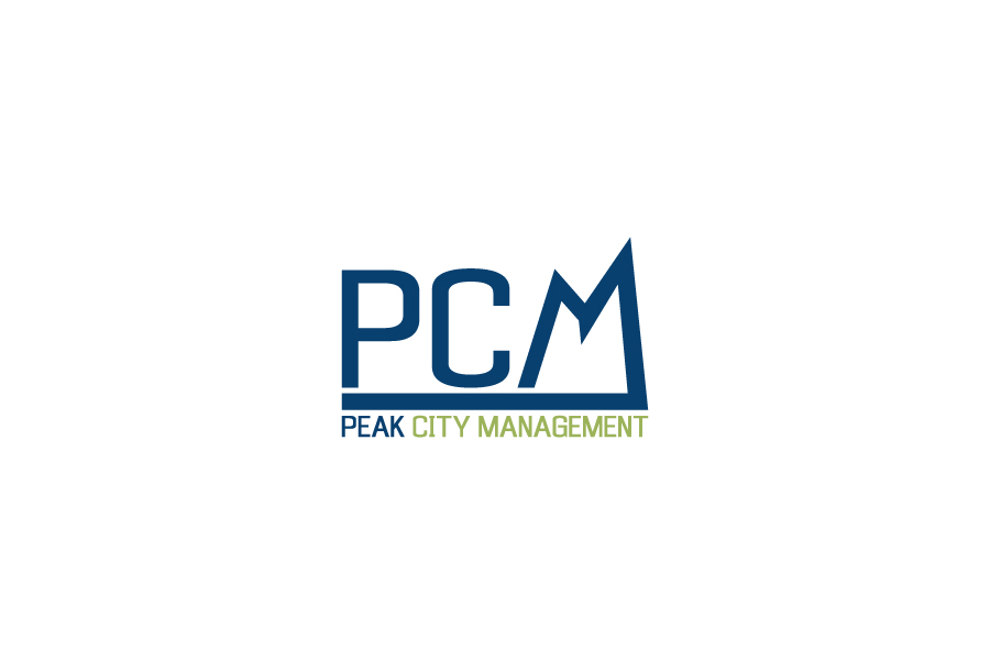
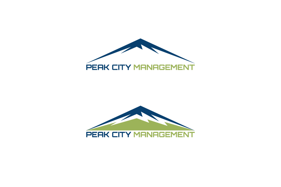
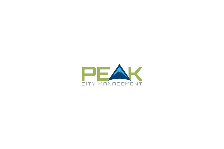
- Step 3: 3 Unique Directions Brought To Life
- Step 4: Unlimited Revisions Of Chosen Design
Revisions
When presented with the 3 unique options it was clear that #3 was the logo direction that stood out the most. From here we worked with the client to develop a clear branding message through several revisions. The team at Peak City Management was extremely happy with the final product and so were we here at Oak City Tech. The logo kept hold of the local roots in Apex NC while showing that the company has modern ideals!
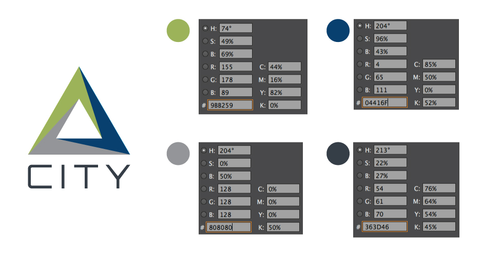
Final Product
Here’s the finished design after revisions.
