
Why You Need A Responsive Mobile-Friendly Design
Google Announces Major Mobile Site Ranking Update. This Is Huge.
We’ve been champions of responsive design since day one. Websites with responsive web design have a special relationship between a mobile and desktop browsing experience because they are one in the same. Now more than ever you need to consider mobile responsive design if you value traffic from Google.
What’s Changing? You Need To Be Mobile-Friendly.
On Feb 26, 2015 Google shocked us all by announcing their plans to change the mobile search algorithm stating, “it will significantly impact search results.” With more than 50% of all web devices being mobile like smartphones and tablets Google is now placing higher relevance on websites that are mobile friendly. You NEED a mobile ready responsive design to continue to rank highly on Google searches.
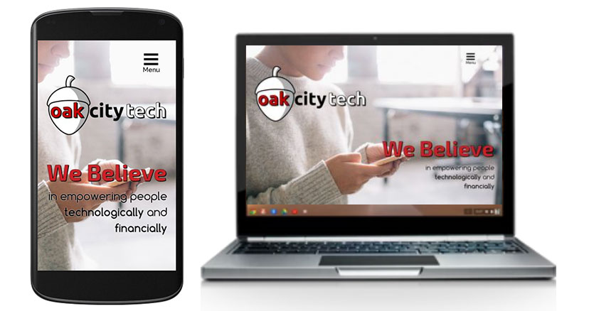
What’s The Difference Between A Mobile Website And Responsive Web Design?
A mobile site is essentially a copy of your website, where the server does the work to deliver an optimized page that’s smaller and easier to navigate. Since a mobile website is essentially a copy of your main website, there is now twice the amount of work if you need your website changed. In responsive design, your website automatically adjusts according to the device’s screen size (large or small) and orientation (landscape or portrait). It switches between these options on-the-fly.
What About SEO And “Link Juice“?
Having a mobile website on a separate subdomain can dilute backlinks and hurt organic search traffic. When a mobile site that uses a separate domain is shared, links will not count as search link equity toward your primary site. (protip: m.website.com is very different from just website.com to search engines.) On the other hand, responsive design lets you keep a single opertaing domain with no changes except code on the back-end. Maintaining a single shared site preserves a canonical URL, avoiding any complicated redirects, and simplifies the sharing of web addresses. Since responsive design simply embeds new code on the back-end of your website, your website’s link equity is 100% preserved.
What Should You Do?
You need to take action immediately and assess if this update could potentially hurt your rankings. Google has kindly provided us a tool that will analyze a URL and report the mobile-friendliness of the site. If you need help navigating through this update and becoming mobile-friendly please contact us for a free assessment.
Want This Handled By An Expert?
Get back to your job and get this handled by a professional. Yes, I Need Help!Not Ready To Get Started?
We can still help you attract new business while working to grow revenue from existing clients and strategic partnerships. Get actionable advice & information right in your inbox from industry experts and professionals.
Google Creative Certified
Google Analytics Certified
 Follow our story
WHERE WE ARE
Oak City Technology
800 Park Offices Drive #3202
Durham, NC 27709
GET IN TOUCH