GoKartNC - Raleigh, NC - Branding & Logo Design Case Study
Rideshare Service "Think Uber For Kids" Branding & Logo DesignChallenge
We here at Oak City Technology were tasked with taking a fresh new idea for a company and creating a logo that accurately reflected the company’s identity. GoKart LLC is a ride sharing service for busy parents. Getting kids from school, to practice, to recitals is what GoKart LLC does best so it’s logo needed to reflect that. GoKart LLC needed needed their logo to portray several things.
Goals
- Incorporate A Car
- Easily Show The Intent Of The Company
- Reflect Their Modern Ideals
- Use Of Minimal And Negative Space
- Match With Current Color Branding
Our Easy 4 Step Process
- Step 1: White-boarding Ideas
- Step 2: Narrow To 3 Unique Directions
- Step 3: 3 Unique Directions Brought To Life
- Step 4: Unlimited Revisions Of Chosen Design
Revisions
When presented with the 3 unique options it was clear that #3 was the logo direction that stood out the most. From here we worked with the client to develop a clear branding message through several revisions. GoKart LLC were extremely happy with the final product and so were we here at Oak City Tech. The final logo effectively hit all of the initial design goals and provided a fun yet professional feel to a company that cares.
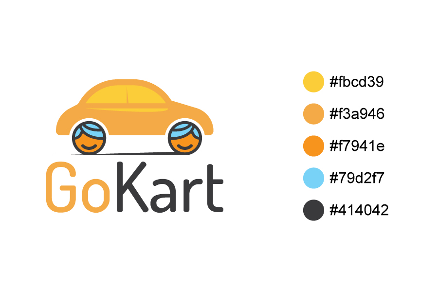
Final Product
Here’s the finished design after revisions.
